What if the colors you trust most are lying to you? A monitor that looks “good enough” can still distort skin tones, crush shadow detail, and shift whites just enough to ruin edits, prints, and client work.
Color accuracy is not a luxury for photographers, designers, video editors, or anyone who cares how an image actually appears beyond their own screen. Without calibration, you are making decisions based on guesswork instead of a reliable visual reference.
This guide explains how to calibrate your monitor step by step, from brightness and gamma to white point and color profiles. You will learn how to make your display match industry standards so what you see is finally close to what others see.
Whether you use a basic home monitor or a professional wide-gamut display, the goal is the same: consistent, predictable color. Once your screen is properly calibrated, every creative decision becomes faster, smarter, and far more trustworthy.
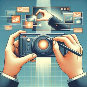
Monitor Calibration Basics: Why Color Accuracy Matters for Photo, Video, and Design Work
Why does calibration matter if your screen already “looks good”? Because pleasing and accurate are not the same thing. A monitor that runs too cool, too saturated, or too bright quietly shifts editing decisions, so the image you export is corrected against an error, not against reality.
In photo work, that usually shows up as skin tones drifting magenta, wedding dresses losing detail, or shadow recovery looking clean on your display but blocked up on a client’s laptop. In video, the damage is often worse: a timeline graded on an overly bright monitor can come back muddy on broadcast QC, especially if you are checking Rec.709 without a controlled white point and luminance target. Design teams feel it too, particularly when brand colors approved in Adobe Photoshop or Figma miss their mark in print proofs or product packaging.
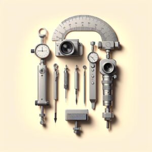
Short version: calibration aligns the monitor to a known standard, while profiling describes how that specific panel behaves. That distinction matters in real workflows, because a hardware calibrator such as Calibrite Display Plus HL or Datacolor Spyder is not just “making the screen nicer” – it is reducing decision error at the point where you actually judge the work.
I’ve seen this catch people off guard. They spend hours fine-tuning an image under office lighting, then wonder why the file looks flat the next morning after daylight hits the room.
- For photographers: accurate brightness prevents chronic underexposure in final exports.
- For editors: stable gamma and white point keep grades consistent across shots and deliverables.
- For designers: reliable color avoids expensive revision cycles between screen comps and print output.
If color is part of the deliverable, monitor accuracy stops being optional and becomes part of quality control.
How to Calibrate Your Monitor Step by Step Using Built-In Settings and Hardware Tools
Start with the monitor’s own controls before touching software. Set the display to its factory-default picture mode, then switch to the most neutral preset available-usually Custom, Standard, or sRGB-and disable dynamic contrast, blue light filters, local dimming tricks, and “vivid” enhancements that fight calibration. Keep brightness at a usable working level rather than chasing maximum punch; in an office with moderate lighting, many people land around 100-120 nits even if they do not know the number yet.
Now the actual sequence matters:
- Use the monitor OSD to set color temperature as close as possible to 6500K and gamma to 2.2 if those options exist.
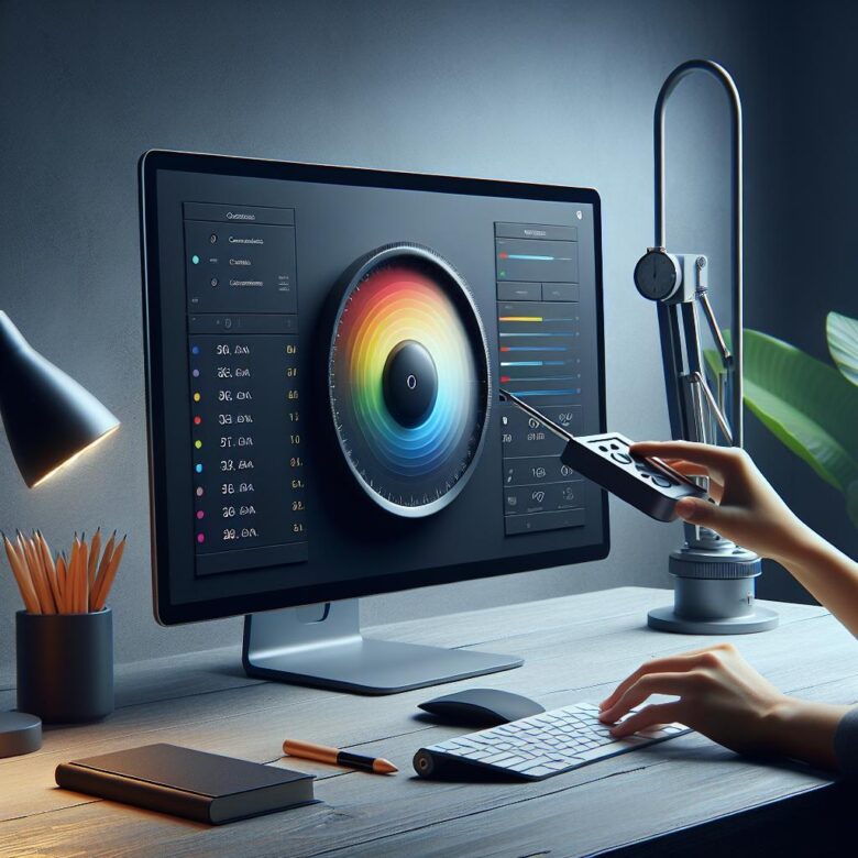
- Open your operating system’s calibration utility for a first pass-Windows Display Color Calibration or macOS Display Calibrator Assistant-to correct obvious black crush, clipped highlights, and rough channel imbalance.
- For accurate work, finish with a hardware calibrator such as Calibrite Display Plus HL or Datacolor Spyder X2 using software like DisplayCAL or the vendor app, then save the ICC profile and set it as system default.
One quick observation: laptop users often miss the biggest variable, and it is not software. Screen angle changes perceived contrast more than most expect, especially on cheaper panels, so calibrate at the angle you actually work at.
In a real photo-editing workflow, I usually ask people to recalibrate after 20 to 30 minutes of monitor warm-up, then verify with a known image containing neutral grays and natural skin tones. If skin suddenly looks sunburned in one app and flat in another, the issue is often color management support, not a failed calibration-so test in color-aware software before blaming the panel.
Common Monitor Calibration Mistakes and Pro Tips for Maintaining Consistent Color Over Time
Most calibration problems are self-inflicted. People profile a display right after powering it on, leave brightness on auto, or calibrate under warm desk lamps at night and then wonder why skin tones shift the next morning. Give the panel 20 to 30 minutes to stabilize, disable dynamic contrast and night modes, and keep room lighting boringly consistent.
A common miss in mixed-device workflows is trusting one “good” screen while the laptop beside it is still wildly off. In a photo edit session, that usually shows up as shadows looking clean on a calibrated external monitor but muddy when the client opens the same file on a second display. If you use dual monitors, profile each one separately with DisplayCAL or the vendor software for your colorimeter, then label the ICC profiles clearly so the operating system does not swap them after an update.
- Recalibrate on a schedule that matches your workload, not a random reminder: monthly for print work, every 6 to 8 weeks for general design, sooner if brightness drift becomes obvious.
- Record target settings in a simple note: white point, luminance, gamma, ambient conditions, and date. This makes troubleshooting faster when a monitor starts behaving differently.
- Recheck after GPU driver changes, macOS or Windows color-management updates, or moving the display to a brighter room.
Small thing. Huge effect.
I have seen editors chase “bad exports” for hours when the real issue was the monitor hood being removed and afternoon light hitting the panel from the side. It sounds minor, but consistency is mostly environmental discipline. The best calibration is the one that still holds up on an ordinary Tuesday, not just five minutes after the meter comes off.
Final Thoughts on How to Calibrate Your Monitor for Perfect Color Accuracy
Perfect color accuracy is not a one-time fix-it’s a maintenance habit that protects the quality of every photo, video, and design decision you make. If color matters to your work, a hardware calibrator is the most reliable choice; if it doesn’t, built-in tools can still deliver a noticeable improvement. The key is to match your calibration method to your needs, your display, and your workflow.
Calibrate regularly, work in consistent lighting, and trust measured results over what “looks right” in the moment. In practice, that means fewer surprises in print, better cross-device consistency, and more confidence that the colors you approve are the colors others will actually see.

Dr. Silas Olive is a leading researcher in display technology and visual ergonomics. With a Ph.D. in Applied Physics, he founded OliveHD to bridge the gap between complex engineering and the everyday user experience. His expertise lies in analyzing panel performance and HDR standards, ensuring that every pixel on your screen meets the highest definition of excellence.